Colour Trends to Know
A home feels most beautiful when it reflects the people who live in it.
by The Umhlanga Writer · · 5 min read
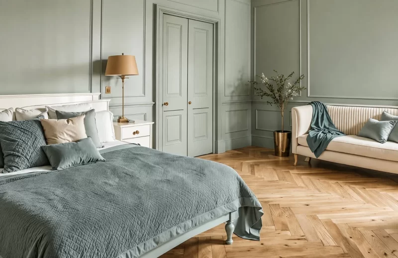
Before I begin, it is worth noting that trends are just that: trends. Being “on trend” does not make what you already have any less beautiful, personal or right for your home. Trends simply show where design is currently heading; sometimes toward something new, sometimes toward something old thoughtfully revisited.
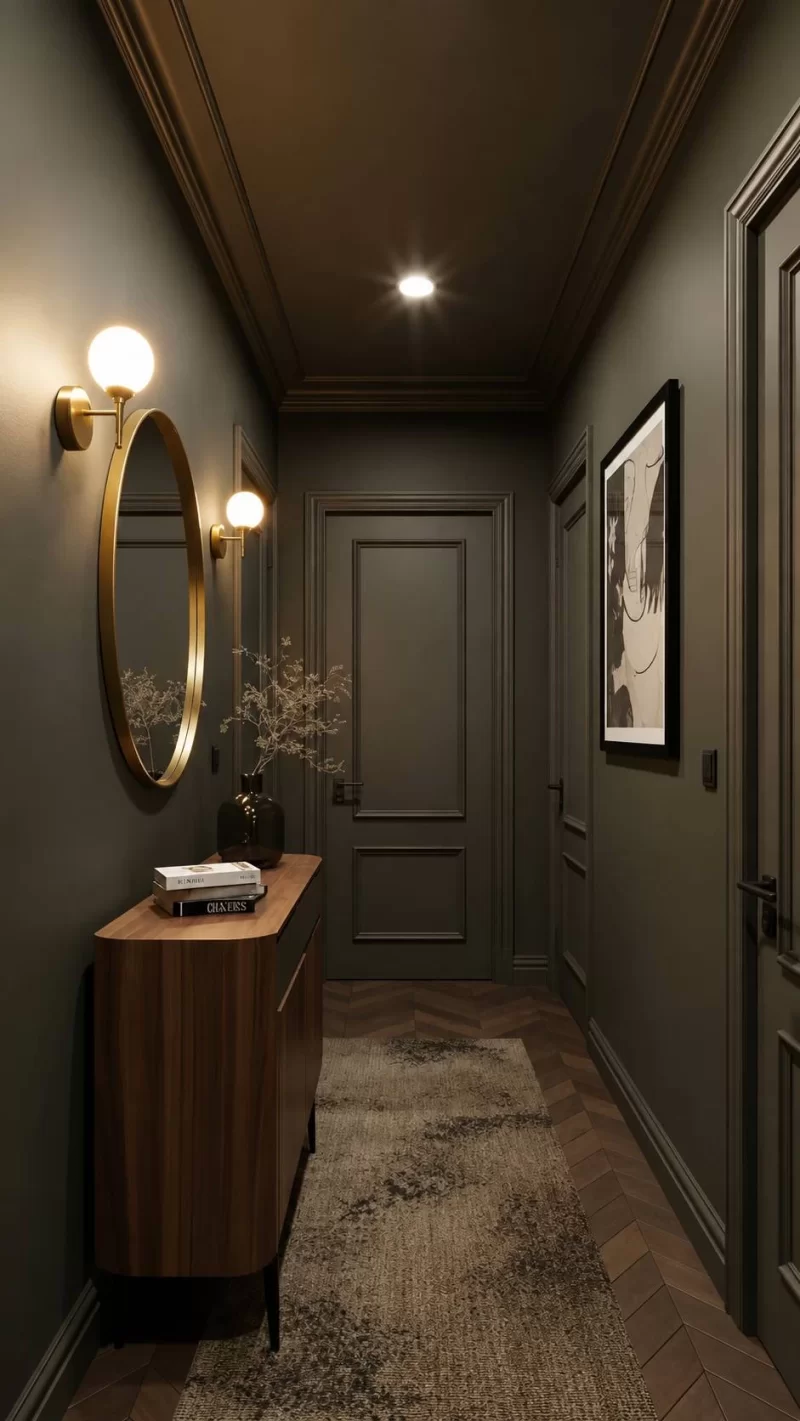
As designers, our role is to filter these movements. Some pass quickly, while others bring ideas that genuinely enrich spaces and make them feel unique, inviting and personal, and last the test of time. I approach this as an architect who loves both architecture and interiors, with experience across high-end residential and commercial projects.
Recently, several clients have expressed the same wish in different ways: a home that feels like a hug, lived in rather than just built, cosy rather than vast and empty. Together, these requests point to a common desire for warm, layered, lived-in spaces, which is strongly reflected in designs across the globe.
Design is shifting toward warm, layered and comforting spaces, with renewed appreciation for curves, sculptural detail, decorative cornices, skirtings, shaker-style cabinetry with considered handles rather than minimalist, gallery-like interiors.
Not all neutrals are considered equal
Current trends favour creamier, richer tones over cooler greys, reinforcing the idea of a home that feels more traditional than something overly fresh or cool. Most designers have a trusted palette of neutral paint colours, both cool and warm, that they return to time and again. These are the shades we have used successfully, grown to love, and feel confident recommending.
There is, however, no one-size-fits-all approach to paint. The right colour depends heavily on the natural and artificial light in the room, as well as the flooring, furniture and finishes around it. I recommend buying three test pots and painting generous sample panels in different areas of your home before choosing the colour that feels right for your space.
Accent colour reimagined
This is still very much here to stay, but it is being used in a more immersive and considered way. Rather than relying on a single accent wall, we are seeing a move towards colour drenching: painting or covering the walls, cornices, ceilings and even selected furniture pieces in the same shade. This approach is not limited to lighter neutrals. Deeper colours once reserved for small accents are now being used more boldly to create spaces that feel distinctive, personal and full of character. Instead of layering multiple colours in one room, spaces are increasingly differentiated through texture: paint, fabric, timber, wallpaper and cladding.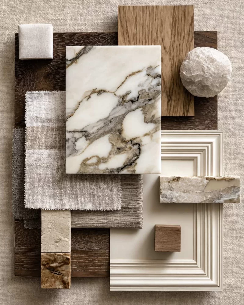
I love this trend, but colour and texture selection is key to ensuring the space has longevity. That does not mean you shouldn’t have fun with it; it simply means the choices should feel intentional. Whether or not you are brave enough to fully colour-drench a room, a rich accent colour remains one of my favourite ways to make a space feel more thoughtful and complete. It can be introduced through furniture, decorative accents, wallpaper or paint.
We are especially drawn to deeper, jewel-toned colours such as burgundy, chocolate, deep sage and grey-blue at the moment. These shades bring depth and warmth, particularly when balanced with fresher coastal elements.
Where to be bold
One of the bravest and most rewarding places to use these richer accent colours is the bathroom. Bathrooms and dressing areas are intimate spaces, which is why I enjoy making them darker, moodier and more atmospheric. A guest loo, in particular, is small enough to handle something more dramatic or playful without detracting from the calm sophistication of the rest of the home.Timber, depth & warmth
These darker, richer colour palettes are also reflected in timber stains, with a noticeable shift from natural oak to deeper walnut tones. Another “rule” that is being revoked, and one I have never personally followed, is the idea that only one timber type should be used in a room. Mixing timbers can be a beautiful way to create depth and variety when they are considered as part of the greater palette. Natural materials such as timber will always have a place in interiors and will remain relevant beyond any single trend.Metallic finishes
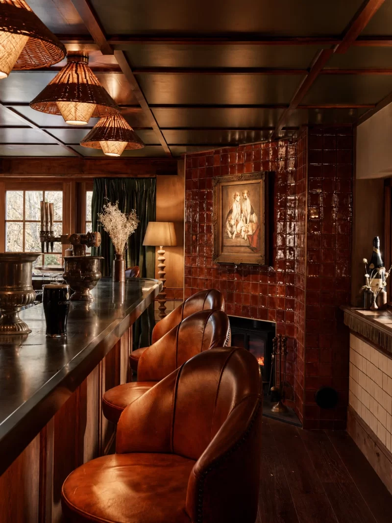
Tapware has also shifted away from matte black towards softer metallic tones such as brushed nickel and brushed champagne. This reinforces our move towards warmer, more traditional aesthetics that are softer and more romantic. I would be more cautious about using these finishes on door handles. For longevity, I usually recommend brushed stainless steel, as it wears exceptionally well, especially when compared with coated products. Not everything in a space needs to match; door handles do not have to become a feature simply because the tapware is.
Be brave
As old design “rules” soften, now is the time to ask what would make your home feel truly yours. The aim is not to follow every trend, but to create a space that feels unique, layered and personal. Be brave with choices that add character:- Add texture through fabric, timber, wallpaper, cladding or paint.
- Drench a room in warm neutrals, olive tones or another grounding colour.
- Reintroduce an inherited meaningful piece, even if it breaks the matched aesthetic.
- Choose details that tell a story, not just follow a formula. Above all, develop your interiors to reflect your personality. A home is most beautiful when it reflects the people who live in it.
Words: Jade Langley
Enjoyed this? See more from The Umhlanga Magazine in your Google results.